Loading images gracefully with react-image-appear

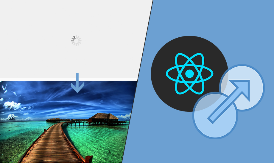
Believe it or not, progressively loading images tend to degrade the overall user experience of a web application. And this can be more concerning for applications that rely heavily on high quality images. To fix this issue, a common technique is to display a placeholder image (for a short span) and replace it with the original image once it has loaded completely.
In this blog post we'll be looking at a React JS based component called react-image-appear, which applies this very same technique and helps in loading images smoothly!

What is react-image-appear ?
It is a React JS component which makes images appear with transition as they load. It basically wraps an image within a placeholder element and adds a gif loader in between.
Usage
Firstly the component needs to be installed using npm or yarn. Using it in your codebase is pretty straightforward, simply import the component and provide the required src prop with any of the available optional props.
Props
Apart from the required src prop there are various optional props that can be used to customise the image loading experience provided by react-image-appear. You can have custom loaders, placeholders, animations etc.


This is the full props list -
- src - The image source. This is a required prop.
- loader - Adds a custom loader to the component. When not provided, applies a default one.
- loaderStyle - Adds custom styling to the loader.
- loaderClass - Adds CSS classes to the loader.
- placeholder - Adds a placeholder background to the component.
- placeholderStyle - Adds custom styling to the placeholder.
- placeholderClass - Adds CSS classes to the placeholder.
- animation - Add a CSS3 powered animation to the image as it appears. Default animation is fadeIn.
- animationDuration - Specifies the animation duration for the image to appear. Default duration is 700ms.
- easing - Specifies the timing-function for the CSS3 powered animation. Default easing is ease-in-out.
- showLoader - Specifies whether to show the loader or not. Default value is true.
To know more about the usage and examples for all the props, you can check out the complete documentation here.
This project has also been ported to AngularJS 1.x - ng-image-appear.
react-image-appear is completely free to use and has been open sourced under the MIT license. For its long term sustenance and growth I recently launched a Patreon page!
If you or your company use react-image-appear or any of my other projects, or like what I'm doing, please consider backing me so I can continue maintaining and working on these projects and new ones. Your pledge could be as small as $1/month. I'd really appreciate your support!
That's it for now! If you have any questions or suggestions, don't forget to leave a comment down below. Also, feel free to say hi 👋 to me on Twitter and Github.
Cheers!